Fall/Winter Color Combos for Misanthropes
AKA anyone who chafes at the words "pastel" or "neon" or even "saturated."
Welcome back, sailors. I’m planning another TREASURE CHEST in these coming weeks — this time on jeans, from my favorite indie labels to mass-market brands with some really dreamy cost-quality ratios. If any of you have recs you’d like me to explore before I finalize the list, let me know.
In the meantime, I wanted to offer something lighter and breezier than my usual fare. As I’ve said before, Fall/Winter is for the absolute sartorial freaks. So many layers… so many options… will anyone indulge me in this Donegal tweed French Lieutenant’s Woman-esque hooded poncho? Or this pair of Tao Comme des Garçons crochet earmuffs? I think I could make them work. At HALOSCOPE, we asked a bunch of psychics what trends are returning next year, and they all aligned on something dark, romantic, and intricate. Do with that what you will.
You might’ve already intuited this by the clothing I write about and respond to, but I love the dark, romantic, and intricate. Neon colors make me gag, and I am too tonally discordant — pale skin, dark hair, all strike and contrast — to pull off pure pastels, as hard as I’ve tried. I cannot control my nature: I like black and white; sweet ivory; old suede; deep jewels; slightly earthy and thalassic hues. It’s not because I find these tones luxurious or patrician but rather because they make me feel well-balanced. I’ve never felt well-balanced in a hot pink slip or a mint-green sweater set. When I’m President (2056), I’m banning the use of salmon or god forbid coral.
SO: I’ve rounded up seven fall/winter color combos that I find moody, chic, and unexpected. Use these for your closets, home decor, or anything else customizable. I’ll do the same for spring/summer eventually — as it’s très difficult to find understated color combinations when everyone is wearing bubblegum pink and pineapple yellow, another color I will be banning, thank you.
In no particular order…
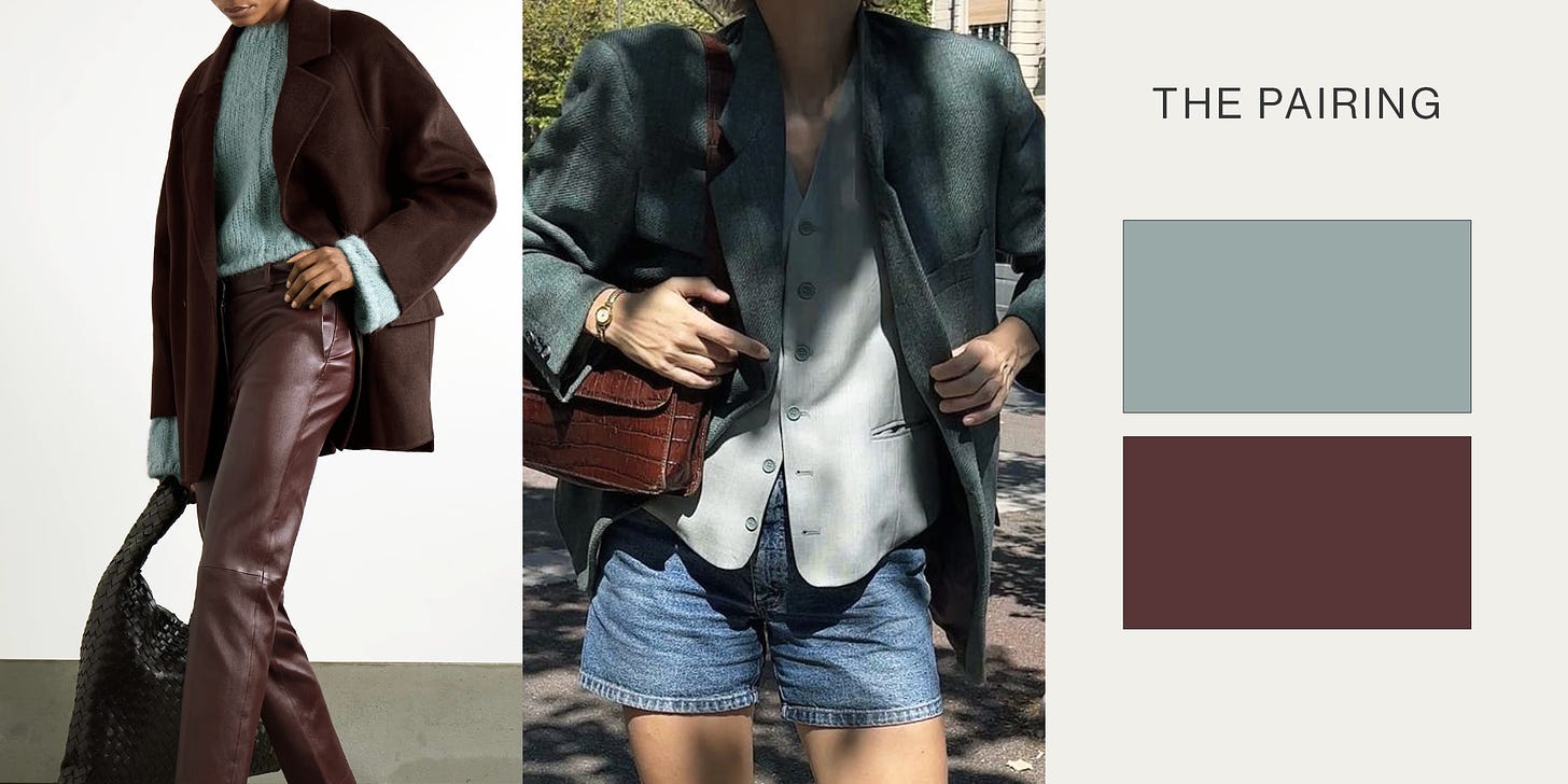
#1: Oxblood and Salty Rain
Trying to find decent reference photos for this combo was like pulling teeth, which may be a good omen — if no one else is wearing this pairing, you’ve got a solid head start. You’re looking for a deep, moody red and a faded robin’s egg gray-teal.
This is ideal for sunny-yet-chilly winter mornings. You’ll need to opt for a slightly warmer red, though not as pigmented as traditional maroon, and a very desaturated gray-teal. Swap for a cool-toned burgundy and a gray-blue if you’d like a colder palette.
Consider:
Keep reading with a 7-day free trial
Subscribe to MERMAID CAFÉ to keep reading this post and get 7 days of free access to the full post archives.


